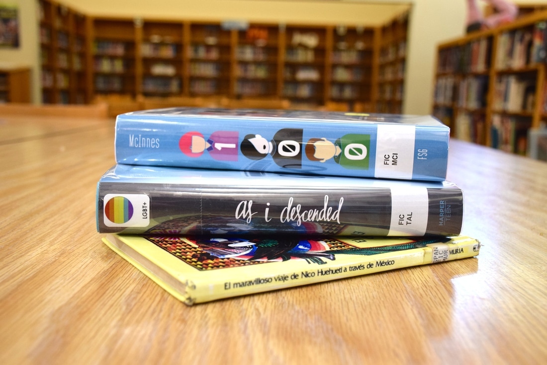
 Diversity is one of the great teachers in life. Diversity promotes individuality and teaches us to celebrate and love the unique characteristics that make each person who they are. Through diversity, one can greatly expand their knowledge. The various races, genders, and sexual orientations that make up the student population on campus allows for a wide variety of views and perspectives to be shared amongst one another. Learning in an environment full of diverse people encourages the spread of new ideas and results in a greater understanding and appreciation of others. The photograph embodies the concept of diversity in an educational system. The books represent the multitude of different people that come together to collaboratively receive an education and further their lives despite race, gender, sexual orientation.
0 Comments
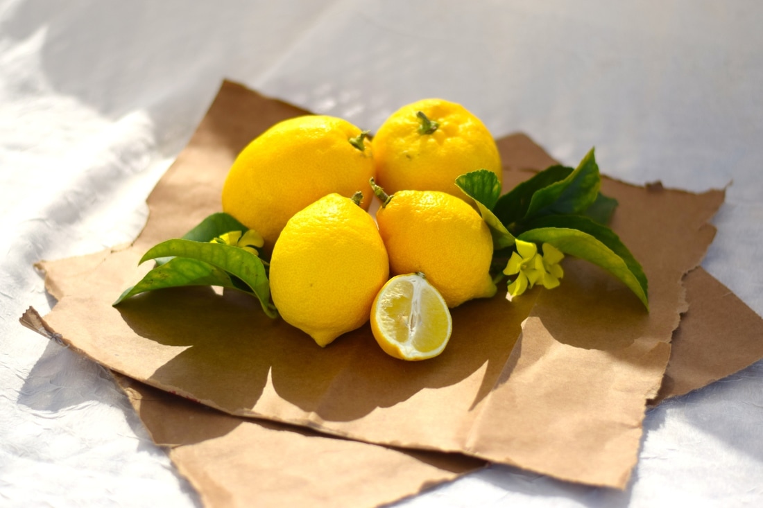 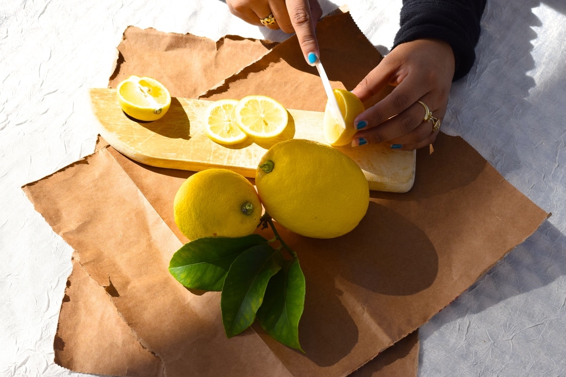 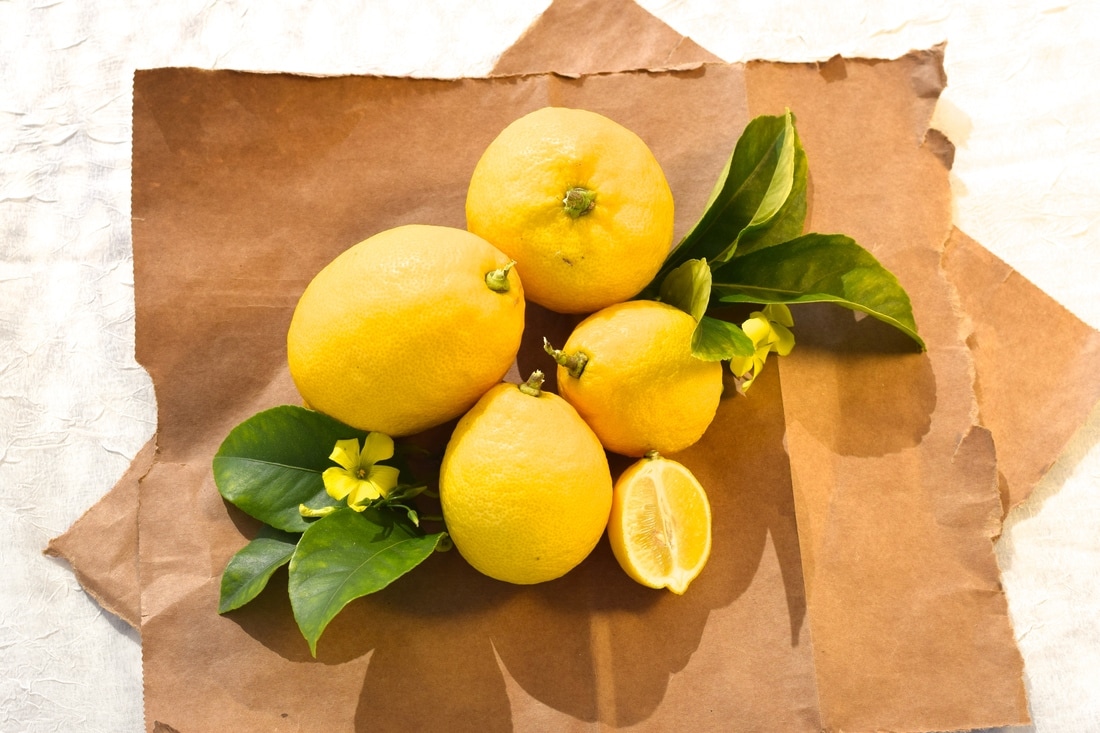 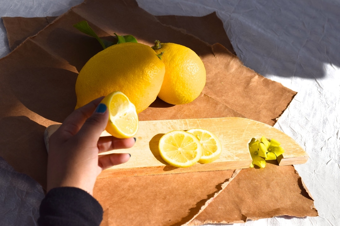 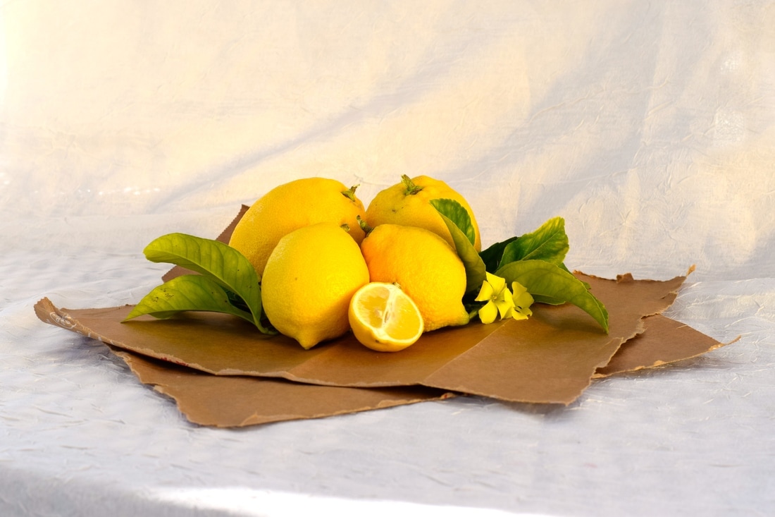 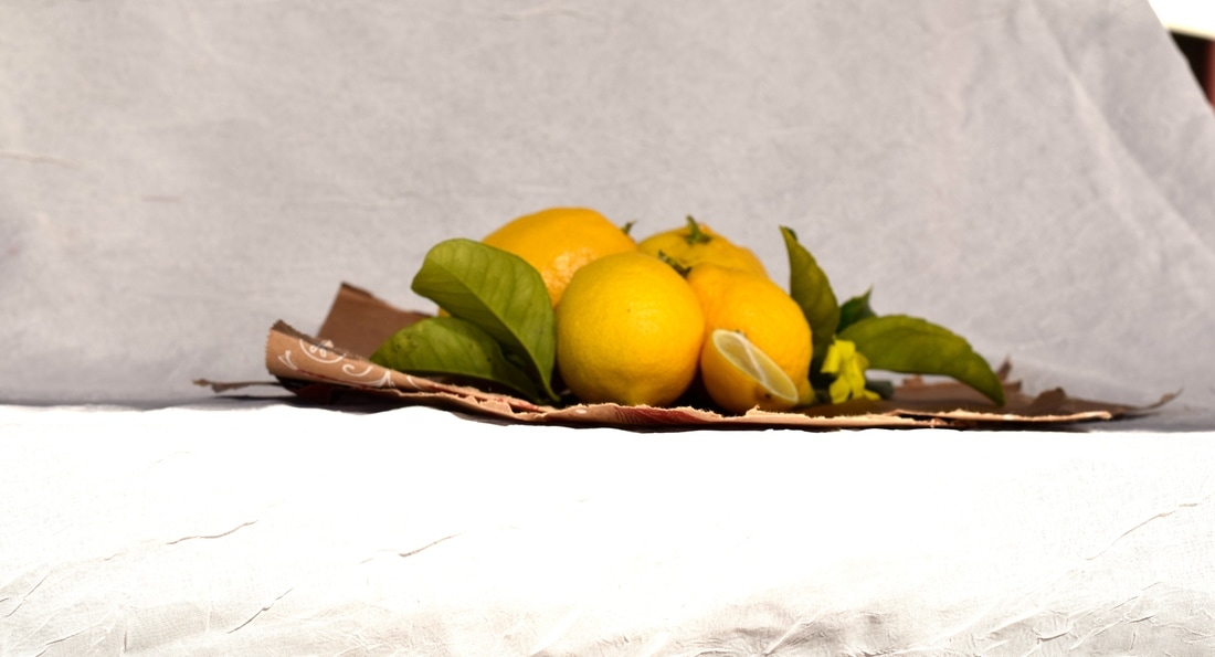 For the food photography project, I brought homegrown lemons from my backyard and some greenery (flowers/ leaves from the lemon tree). The props I used include a brown paper bag that I tore into pieces to add a natural, rustic look and a sheer/ white tablecloth. I learned a lot of useful tips from the food photography video and presentation. I learned that lighting, props, background, style, and the speed in which the photo is taken are all key things to keep in mind when photographing food. Lighting is important because it highlights the main focus of the image, the food. Light reflectors are great for adding light (warm/ white/ etc) to the food to make it appear fresher/ more appealing. Props can add to the overall appeal of the photo; for example a colorful plate and shiny utensils can boost to the appeal. Backgrounds, like props, add to the appeal and can help reflect light onto the food. Food styling is immensely important because it sets up the whole photo. The food must be positioned and adjusted to appear as appetizing as possible to the camera. Speed is also key when taking photos of food, especially hot/ cold food. It is important to take photos of the food right away to capture steam, frost/ "sweat" on the glass of a cold drink, etc. I mirrored professional food photographers by styling the fruit similarly and using similar props. While taking photos of food, I was reminded of the major impact light has on the appearance and appeal of food. Restaurants use food photography a lot with advertising. I think I was successful in styling the food and setting. I really enjoyed styling the food and definitely would do it again.
 To create the final image, I first shot the photographs of the letters I was going to use to spell my nickname, Kate. I adjusted the photos to be in black and white in iPhoto. To get the name template in photoshop, I opened the 4-letter name template in Finder under period 5 in the "Name Project" folder. Once the template was opened in Photoshop, I used the move tool and dragged the photos into the four slots provided. I sized them to fit exactly in the boxes, after each photo making sure to click on the check to keep the photos in place. I then adjusted the brightness by going to image, adjustments, brightness/ darkness. I then saved the image in the common folder (name project). It was difficult to find objects/ paintings that resembled the letters I needed to create my name (abbreviated version). The "K" was especially difficult, as it is a hard shape to find in nature. I also experienced some difficultly getting the images to fit perfectly in the template lines, as there was an image already in the template that protruded the lines and could be seen from underneath my image. I was able to fix the problem after some experimenting on photoshop. I am most happy with the way the actual letters came out. They clearly display the letter that I wanted for my name: K-A-T-E. The only thing I would have liked to fix would be the "T". I would have liked for it to look less like a cross and not take up the whole image.
|
AuthorArchives
June 2017
Categories |
 RSS Feed
Photo used under Creative Commons from Jori Samonen
